Théorie des couleurs 101 : Choisir la palette idéale pour votre exposition d'art
Ever find yourself captivated by an art display only to realize it’s not just the artwork that’s mesmerizing, but also the cohesive blend of colors pulling everything together? That’s the power of color theory. In home decor, understanding how to choose the right hues can elevate your prints from simple wall art to a statement-worthy focal point. Below, we break down the basics of color theory and share strategic tips for selecting the perfect palette for your art display.
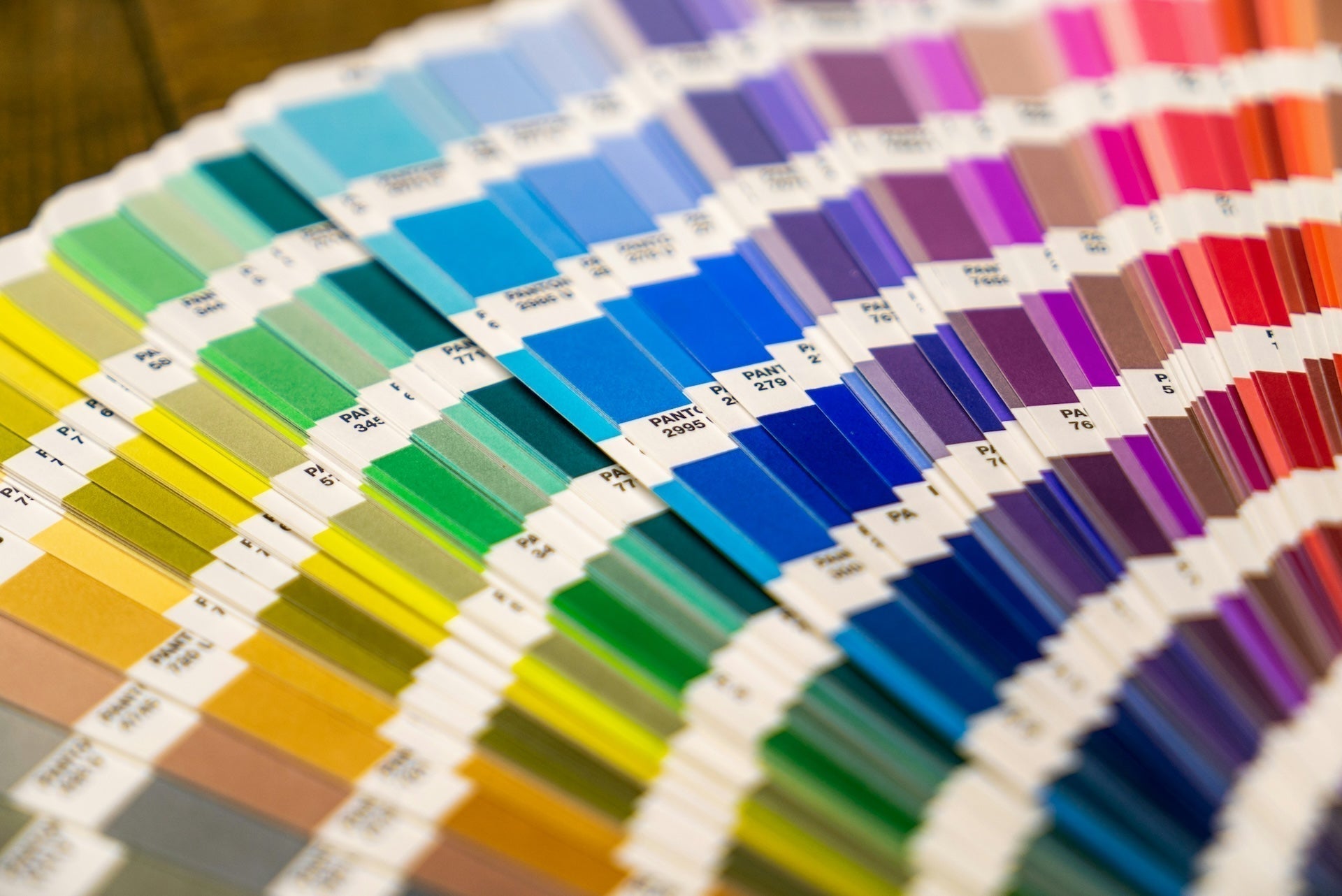
1. Begin with Basic Color Theory
At its core, color theory explains how colors relate and contrast with each other. A few foundational terms to keep in mind:
- Primary Colors: Red, blue, and yellow. These can’t be created by mixing other hues.
- Secondary Colors: Green, orange, and purple, formed by mixing two primary colors.
- Tertiary Colors: Created by mixing primary and secondary colors (like red-orange or blue-green).
Why It Matters: This knowledge helps you determine which color combinations feel harmonious (analogous colors, like blue and green) versus those that bring out a dynamic pop (complementary colors, like blue and orange).

2. Know Your Undertones
Have you ever noticed how different shades of the same color can appear warm or cool? That’s the undertone at play.
- Warm Undertones: Yellows, oranges, and reds form the foundation of a warm color palette.
- Cool Undertones: Blues, purples, and most greens tend to give rooms a calming, cooler vibe.
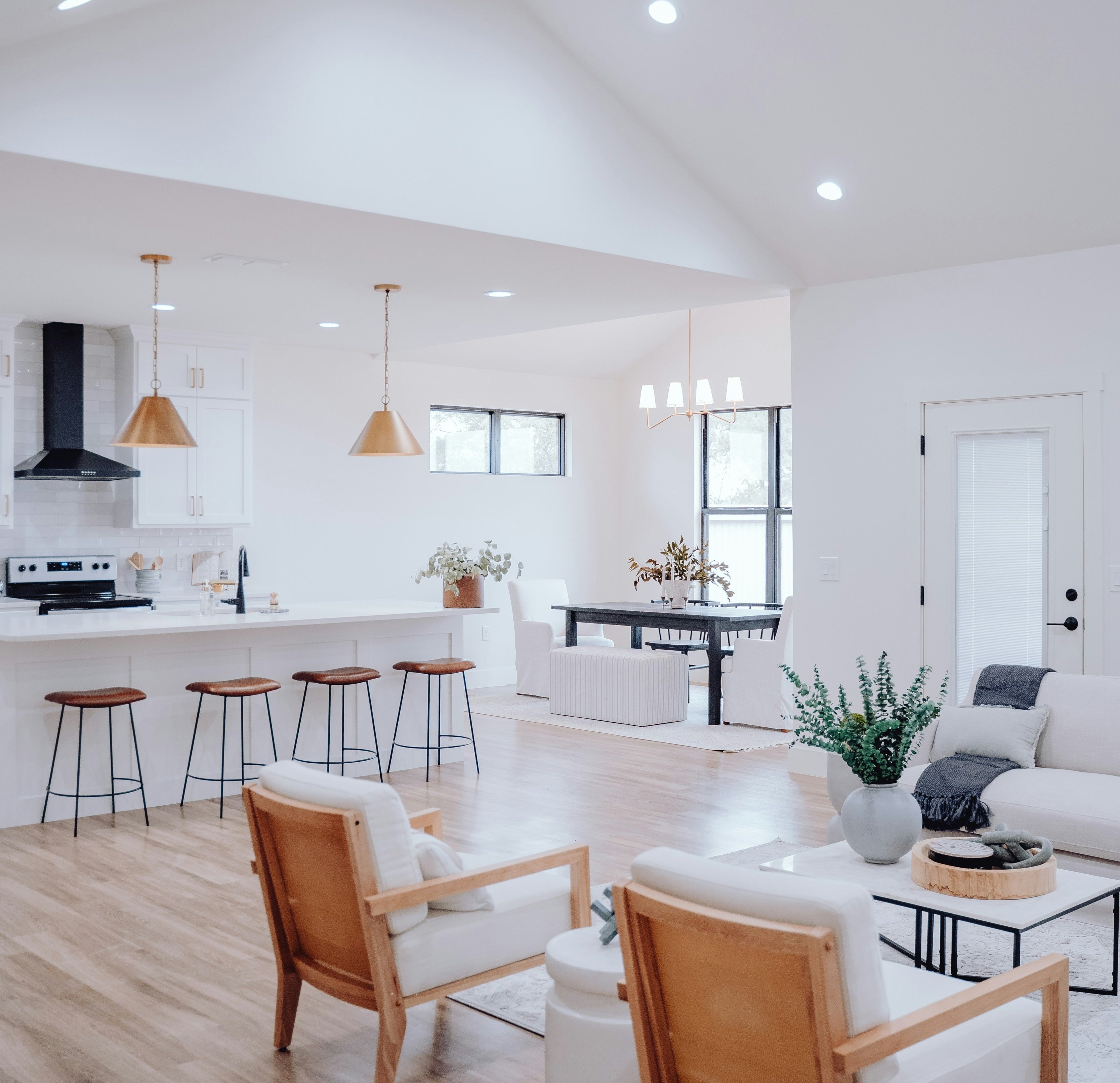
How to Apply It: If you’re aiming for a cozy, romantic atmosphere (think vintage French chic), lean toward warm hues, like soft blush, cream, or muted terracotta. If you prefer a modern, calming aesthetic, cool undertones in blues or grays can be your go-to.

Source: Unsplash @awhstin
3. Decide on Your Visual Contrast
Contrast is what makes a display pop. Too little contrast, and everything blends together; too much, and it can feel overwhelming.
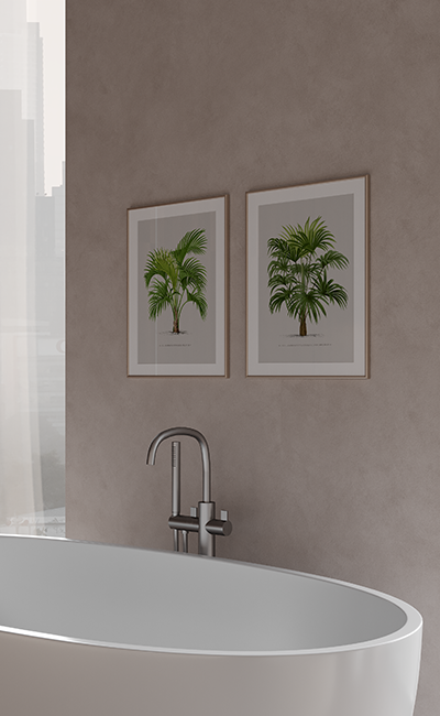
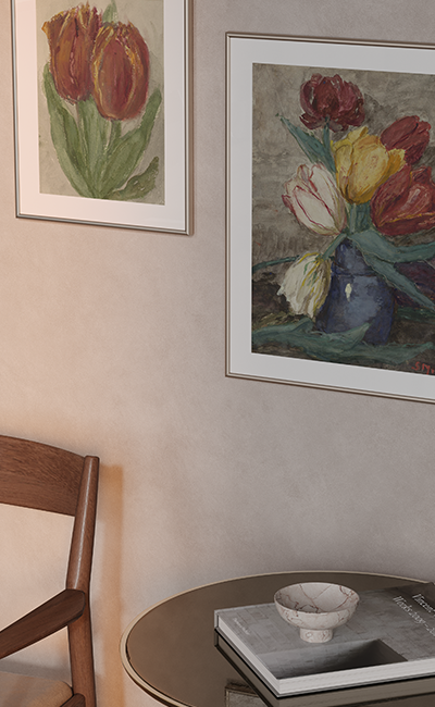
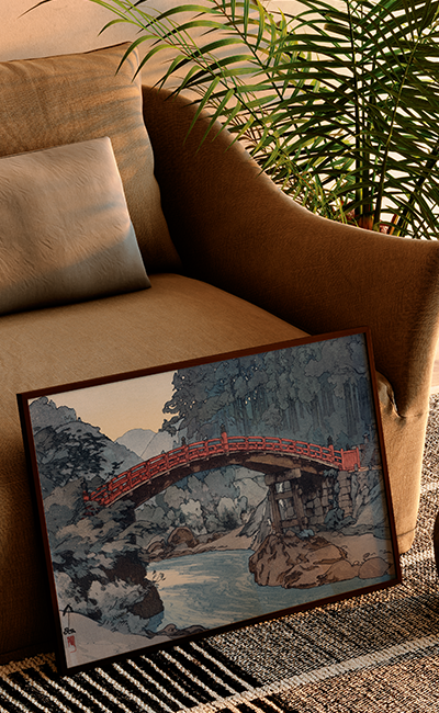
- Complementary Colors: Pairs like navy blue and muted orange create bold statements. If you have an orange-tinted gouache print, consider placing it on a deep blue wall or using navy accents nearby.
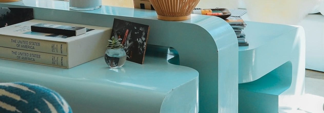
- Tone-on-Tone: For a quieter but elegant look, use varying shades of the same color family (e.g., multiple pale pink or soft beige prints with subtle gold or cream frames).
Pro Tip: If your chosen art has multiple accent colors, pick one dominant hue from it and repeat that color elsewhere in the room, for example in throw pillows or a nearby vase to tie it all together.

Source: Unsplash @beazy
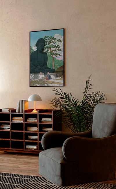
4. Consider the Mood You Want to Create
Color has a profound influence on mood. Ask yourself what emotional tone you’d like your space to convey.
- Serene & Calming: Soft blues, grays, and warm whites are ideal for bedrooms or reading nooks.
- Romantic & Warm: Earthy pinks, terracottas, and subtle gold accents suit living rooms or dining areas.
- Vibrant & Energizing: Bold jewel tones or bright complementary colors can transform a home office or entryway into an inviting, creative space.
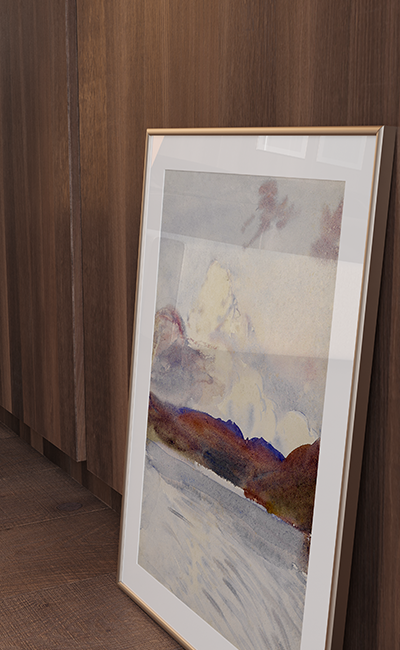
Guiding Principle: If a print has strong emotional appeal, like a soothing watercolor of a French countryside, build your palette around that emotion. Let the artwork guide wall colors, accent pieces, or even small decorative items.

Source: Unsplash @heftiba
A little planning up front can turn any wall into a harmoniously vibrant showcase of your style. Whether you lean toward warm earth tones or cool, elegant hues, your final goal is a display that feels balanced, inviting, and uniquely personal. Let's create an artful, beautifully coordinated home!